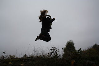
I like this picture because the sun is off center. This was our first assignment and I was trying to get a clean composition and background as well as having foreground.
This portrait shows framing. The subject is also the middle of the photo, and the two subjects that aren't in focus add to the foreground.
The lines in this photo draws you eye to the top of the hand, which also where the light is. The arm coming in from the top right hand corner leads the viewer's focus point to the hand as well.
This portrait shows the rule of thirds, the clean background draws the focus strait to the subject. Putting her in the left side of the photo also helps show her surroundings and the viewer a better look into her personality.
This frame has a strong foreground and a contributing background. The bulletin board is the subject, but the person who is out of focus helps the photo show that it is a school environment.
The clean background and dominating foreground helps draw focus to where the camera was pointed. The shiny metal reflects some of the surroundings, which also draws the viewer's eye.


